Legacy editors
editLegacy editors
editAggregation-based
editAggregation-based visualizations are the core Kibana panels, and are not optimized for a specific use case.
With aggregation-based visualizations, you can:
- Split charts up to three aggregation levels, which is more than Lens and TSVB
- Create visualization with non-time series data
- Use a saved search as an input
- Sort data tables and use the summary row and percentage column features
- Assign colors to data series
- Extend features with plugins
Aggregation-based visualizations include the following limitations:
- Limited styling options
- Math is unsupported
- Multiple indices is unsupported
Types of aggregation-based visualizations
editKibana supports the following types of aggregation-based visualizations.
|
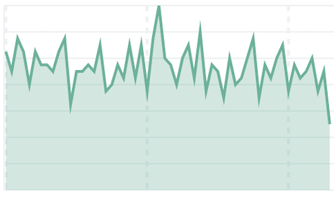
Area Displays data points, connected by a line, where the area between the line and axes are shaded. Use area charts to compare two or more categories over time, and display the magnitude of trends. |
|
|
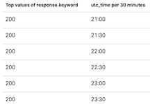
Data table Displays your aggregation results in a tabular format. Use data tables to display server configuration details, track counts, min, or max values for a specific field, and monitor the status of key services. |
|
|
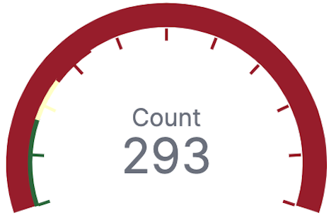
Gauge Displays your data along a scale that changes color according to where your data falls on the expected scale. Use the gauge to show how metric values relate to reference threshold values, or determine how a specified field is performing versus how it is expected to perform. |
|
|
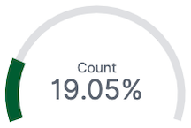
Goal Displays how your metric progresses toward a fixed goal. Use the goal to display an easy to read visual of the status of your goal progression. |
|
|
Heat map Displays graphical representations of data where the individual values are represented by colors. Use heat maps when your data set includes categorical data. For example, use a heat map to see the flights of origin countries compared to destination countries using the sample flight data. |
|
|
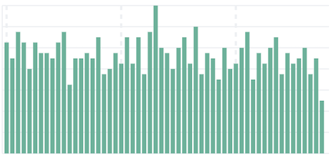
Horizontal Bar Displays bars side-by-side where each bar represents a category. Use bar charts to compare data across a large number of categories, display data that includes categories with negative values, and easily identify the categories that represent the highest and lowest values. Kibana also supports vertical bar charts. |
|
|
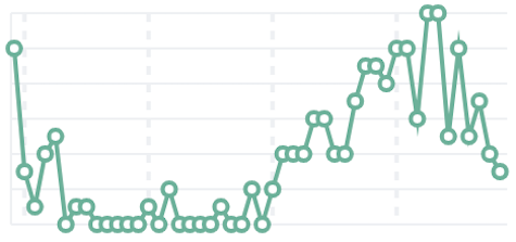
Line Displays data points that are connected by a line. Use line charts to visualize a sequence of values, discover trends over time, and forecast future values. |
|
|
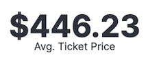
Metric Displays a single numeric value for an aggregation. Use the metric visualization when you have a numeric value that is powerful enough to tell a story about your data. |
|
|
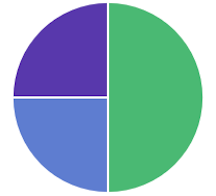
Pie Displays slices that represent a data category, where the slice size is proportional to the quantity it represents. Use pie charts to show comparisons between multiple categories, illustrate the dominance of one category over others, and show percentage or proportional data. |
|
|
Tag cloud Graphical representations of how frequently a word appears in the source text. Use tag clouds to easily produce a summary of large documents and create visual art for a specific topic. |
|

Create an aggregation-based visualization panel
editChoose the type of visualization you want to create, then use the editor to configure the options.
-
On the dashboard, click All types > Aggregation based.
- Select the visualization type you want to create.
-
Select the data source you want to visualize.
There is no performance impact on the data source you select. For example, Discover saved searches perform the same as data views.
-
Add the aggregations you want to visualize using the editor, then click Update.
For the Date Histogram to use an auto interval, the date field must match the primary time field of the data view.
-
To change the order, drag and drop the aggregations in the editor.

-
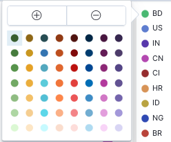
To customize the series colors, click the series in the legend, then select the color you want to use.
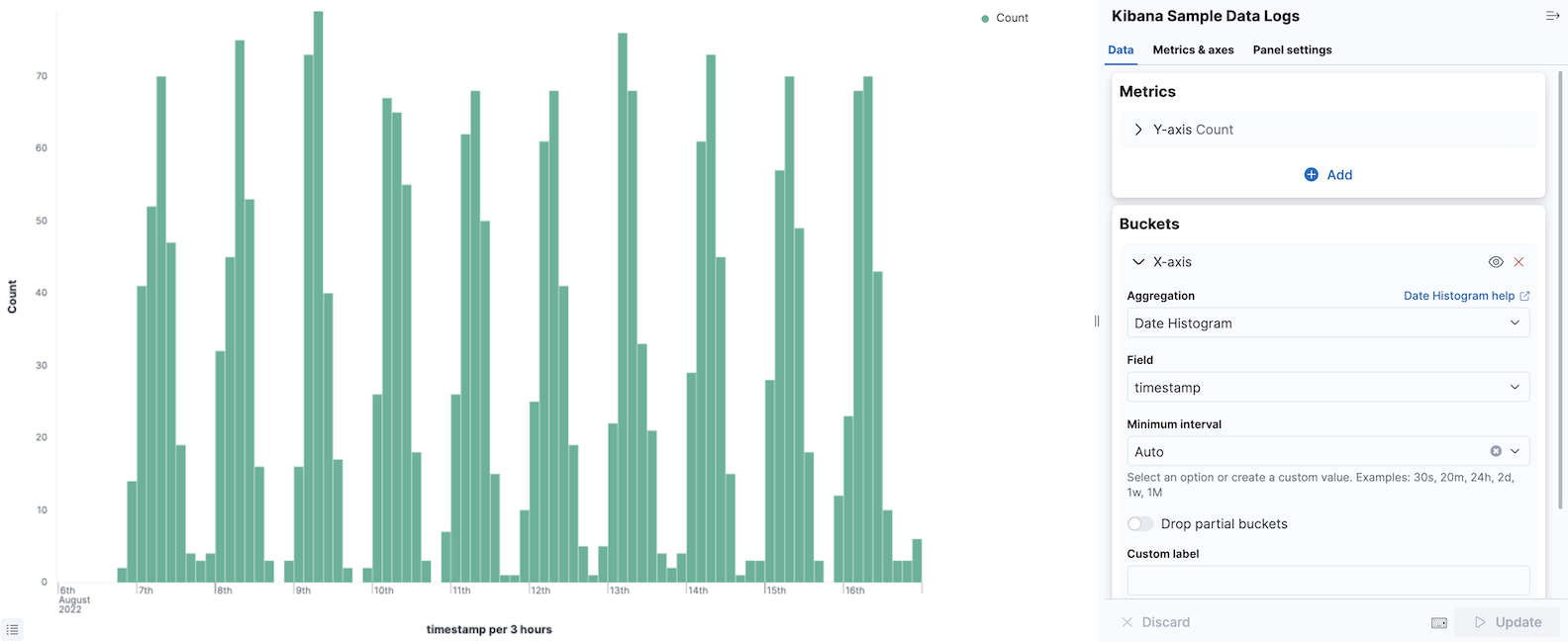
Try it: Create an aggregation-based bar chart
editYou collected data from your web server, and you want to visualize and analyze the data on a dashboard. To create a dashboard panel of the data, create a bar chart that displays the top five log traffic sources for every three hours.
Add the data and create the dashboard
editAdd the sample web logs data that you’ll use to create the bar chart, then create the dashboard.
- Install the web logs sample data set.
- Go to Dashboards.
- On the Dashboards page, click Create dashboard.
Open and set up the aggregation-based bar chart
editOpen the Aggregation based editor and change the time range.
- On the dashboard, click All types > Aggregation based, select Vertical bar, then select Kibana Sample Data Logs.
- Make sure the time filter is Last 7 days.
Create the bar chart
editTo create the bar chart, add a bucket aggregation, then add the terms sub-aggregation to display the top values.
-
Add a Buckets aggregation.
- Click Add, then select X-axis.
- From the Aggregation dropdown, select Date Histogram.
-
Click Update.
-
To show the top five log traffic sources, add a sub-bucket aggregation.
-
Click Add, then select Split series.
Aggregation-based panels support a maximum of three Split series.
- From the Sub aggregation dropdown, select Terms.
- From the Field dropdown, select geo.src.
-
Click Update.
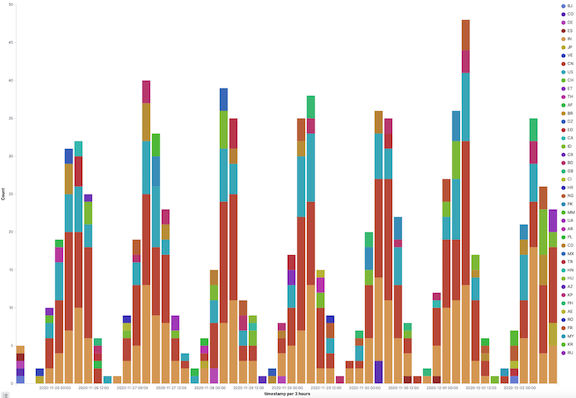
-
Open and edit aggregation-based visualizations in Lens
editWhen you open aggregation-based visualizations in Lens, all configuration options appear in the Lens visualization editor.
You can open the following aggregation-based visualizations in Lens:
- Area
- Data table
- Gauge
- Goal
- Heat map
- Horizontal bar
- Line
- Metric
- Pie
- Vertical bar
To get started, click Edit visualization in Lens in the toolbar.
For more information, check out Create visualizations with Lens.
Save and add the panel
editSave the panel to the Visualize Library and add it to the dashboard, or add it to the dashboard without saving.
To save the panel to the Visualize Library:
- Click Save to library.
- Enter the Title and add any applicable Tags.
- Make sure that Add to Dashboard after saving is selected.
- Click Save and return.
To save the panel to the dashboard:
- Click Save and return.
-
Add an optional title to the panel.
- In the panel header, click No Title.
- On the Panel settings window, select Show title.
- Enter the Title, then click Save.
TSVB
editTSVB is a set of visualization types that you configure and display on dashboards.
With TSVB, you can:
- Combine an infinite number of aggregations to display your data.
- Annotate time series data with timestamped events from an Elasticsearch index.
- View the data in several types of visualizations, including charts, data tables, and markdown panels.
- Display multiple data views in each visualization.
- Use custom functions and some math on aggregations.
- Customize the data with labels and colors.
Open and set up TSVB
editOpen TSVB, then configure the required settings. You can create TSVB visualizations with only data views, or Elasticsearch index strings.
When you use only data views, you are able to:
- Create visualizations with runtime fields
- Add URL drilldowns
- Add interactive filters for time series visualizations
- Improve performance
Creating TSVB visualizations with an Elasticsearch index string is deprecated and will be removed in a future release. By default, you create TSVB visualizations with only data views. To use an Elasticsearch index string, contact your administrator, or go to Advanced Settings and set metrics:allowStringIndices to true.
- On the dashboard, click Select type, then select TSVB.
- In TSVB, click Panel options, then specify the Data settings.
- Open the Data view mode options next to the Data view dropdown.
- Select Use only Kibana data views.
- From the Data view dropdown, select the data view, then select the Time field and Interval.
-
Select a Drop last bucket option.
By default, TSVB drops the last bucket because the time filter intersects the time range of the last bucket. To view the partial data, select No.
- To view a filtered set of documents, enter KQL filters in the Panel filter field.
Configure the series
editEach TSVB visualization shares the same options to create a Series. Each series can be thought of as a separate Elasticsearch aggregation. The Options control the styling and Elasticsearch options, and are inherited from Panel options. When you have separate options for each series, you can compare different Elasticsearch indices, and view two time ranges from the same index.
To configure the value of each series, select the function, then configure the function inputs. Only the last function is displayed.
-
From the Aggregation dropdown, select the function for the series. TSVB provides you with shortcuts for some frequently-used functions:
- Filter Ratio
- Returns a percent value by calculating a metric on two sets of documents. For example, calculate the error rate as a percentage of the overall events over time.
- Counter Rate
- Used when dealing with monotonically increasing counters. Shortcut for Max, Derivative, and Positive Only.
- Positive Only
- Removes any negative values from the results, which can be used as a post-processing step after a derivative.
- Series Agg
- Applies a function to all of the Group by series to reduce the values to a single number. This function must always be the last metric in the series. For example, if the Time Series visualization shows 10 series, the sum Series Agg calculates the sum of all 10 bars and outputs a single Y value per X value. This is often confused with the overall sum function, which outputs a single Y value per unique series.
- Math
- For each series, apply simple and advanced calculations. Only use Math for the last function in a series.
-
To display each group separately, select one of the following options from the Group by dropdown:
- Filters — Groups the data into the specified filters. To differentiate the groups, assign a color to each filter.
- Terms — Displays the top values of the field. The color is only configurable in the Time Series chart. To configure, click Options, then select an option from the Split color theme dropdown.
- Click Options, then configure the inputs for the function. For example, to use a different field format, make a selection from the Data formatter dropdown.
TSVB visualization options
editThe configuration options differ for each TSVB visualization.
Time Series
editBy default, the y-axis displays the full range of data, including zero. To automatically scale the y-axis from
the minimum to maximum values of the data, click Data > Options > Fill, then enter 0 in the Fill field.
You can add annotations to the x-axis based on timestamped documents in a separate Elasticsearch index.
All chart types except Time Series
editThe Data timerange mode dropdown in Panel options controls the timespan that TSVB uses to match documents. Last value is unable to match all documents, only the specific interval. Entire timerange matches all documents specified in the time filter.
Metric, Top N, and Gauge
editColor rules in Panel options contains conditional coloring based on the values.
Top N and Table
editWhen you click a series, TSVB applies a filter based on the series name. To change this behavior, click Panel options, then specify a URL in the Item URL field, which opens a URL instead of applying a filter on click.
Markdown
editThe Markdown visualization supports Markdown with Handlebar (mustache) syntax to insert dynamic data, and supports custom CSS.
Open and edit TSVB visualizations in Lens
editWhen you open TSVB visualizations in Lens, all configuration options and annotations appear in the Lens visualization editor.
You can open the following TSVB visualizations in Lens:
- Time Series
- Metric
- Top N
- Gauge
- Table
To get started, click Edit visualization in Lens in the toolbar.
For more information, check out Create visualizations with Lens.
View the visualization data requests
editView the requests that collect the visualization data.
- In the toolbar, click Inspect.
- From the Request dropdown, select the series you want to view.
Save and add the panel
editSave the panel to the Visualize Library and add it to the dashboard, or add it to the dashboard without saving.
To save the panel to the Visualize Library:
- Click Save to library.
- Enter the Title and add any applicable Tags.
- Make sure that Add to Dashboard after saving is selected.
- Click Save and return.
To save the panel to the dashboard:
- Click Save and return.
-
Add an optional title to the panel.
- In the panel header, click No Title.
- On the Panel settings window, select Show title.
- Enter the Title, then click Save.
Frequently asked questions
editFor answers to frequently asked TSVB question, review the following.
How do I create dashboard drilldowns for Top N and Table visualizations?
You can create dashboard drilldowns that include the specified time range for Top N and Table visualizations.
- Open the dashboard that you want to link to, then copy the URL.
- Open the dashboard with the Top N and Table visualization panel, then click Edit in the toolbar.
- Open the Top N or Table panel menu, then select Edit visualization.
- Click Panel options.
-
In the Item URL field, enter the URL.
For example
dashboards#/view/f193ca90-c9f4-11eb-b038-dd3270053a27. - Click Save and return.
- In the toolbar, click Save as, then make sure Store time with dashboard is deselected.
How do I base drilldown URLs on my data?
You can build drilldown URLs dynamically with your visualization data.
Do this by adding the {{key}} placeholder to your URL
For example https://example.org/{{key}}
This instructs TSVB to substitute the value from your visualization wherever it sees {{key}}.
If your data contain reserved or invalid URL characters such as "#" or "&", you should apply a transform to URL-encode the key like this {{encodeURIComponent key}}. If you are dynamically constructing a drilldown to another location in Kibana (for example, clicking a table row takes to you a value-scoped saved search), you will likely want to Rison-encode your key as it may contain invalid Rison characters. (Rison is the serialization format many parts of Kibana use to store information in their URL.)
For example: discover#/view/0ac50180-82d9-11ec-9f4a-55de56b00cc0?_a=(filters:!((query:(match_phrase:(foo.keyword:{{rison key}})))))
If both conditions apply, you can cover all cases by applying both transforms: {{encodeURIComponent (rison key)}}.
Technical note: TSVB uses Handlebars to perform these interpolations. rison and encodeURIComponent are custom Handlebars helpers provided by Kibana.
Why is my TSVB visualization missing data?
It depends, but most often there are two causes:
- For Time series visualizations with a derivative function, the time interval can be too small. Derivatives require sequential values.
- For all other TSVB visualizations, the cause is probably the Data timerange mode, which is controlled by Panel options > Data timerange mode > Entire time range. By default, TSVB displays the last whole bucket. For example, if the time filter is set to Last 24 hours, and the current time is 9:41, TSVB displays only the last 10 minutes — from 9:30 to 9:40.
How do I calculate the difference between two data series?
How do I compare the current versus previous month?
TSVB can display two series with time offsets, but it can’t perform math across series. To add a time offset:
-
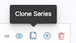
Click Clone Series, then choose a color for the new series.
- Click Options, then enter the offset value in the Offset series time by field.
How do I calculate a month over month change?
The ability to calculate a month over month change is not fully supported in TSVB, but there is a special case that is supported if the
time filter is set to 3 months or more and the Interval is 1m. Use the Derivative to get the absolute monthly change. To convert to a percent,
add the Math function with the params.current / (params.current - params.derivative) formula, then select Percent from the Data Formatter dropdown.
For other types of month over month calculations, use Timelion or Vega.
How do I calculate the duration between the start and end of an event?
Calculating the duration between the start and end of an event is unsupported in TSVB because TSVB requires correlation between different time periods. TSVB requires that the duration is pre-calculated.
Timelion
editTo use Timelion, you define a graph by chaining functions together, using the Timelion-specific syntax. The syntax enables some features that classical point series charts don’t offer, such as pulling data from different indices or data sources into one graph.
Timelion is driven by a simple expression language that you use to:
- Retrieve time series data from one or more indices
- Perform math across two or more time series
- Visualize the results
Timelion expressions
editTimelion functions always start with a dot, followed by the function name, followed by parentheses containing all the parameters to the function.
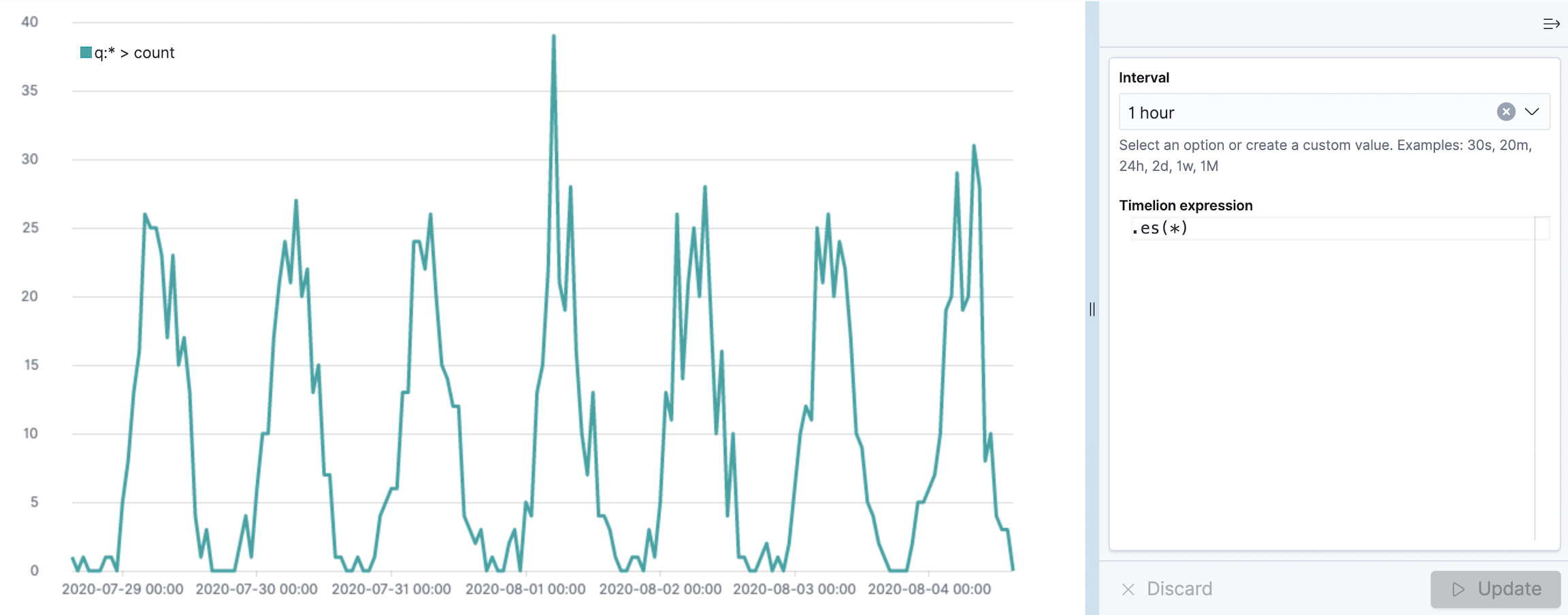
The .es (or .elasticsearch if you are a fan of typing long words) function gathers data from Elasticsearch and draws it over time. By default the .es function will just count the number of documents, resulting in a graph showing the amount of documents over time.
Function parameters
editFunctions can have multiple parameters, and so does the .es function. Each parameter has a name, that you can use inside the parentheses to set its value. The parameters also have an order, which is shown by the autocompletion or the documentation (using the Docs button in the top menu).
If you don’t specify the parameter name, timelion assigns the values to the parameters in the order, they are listed in the documentation.
The fist parameter of the .es function is the parameter q (for query), which is a Query String used to filter the data for this series. You can also explicitly reference this parameter by its name, and I would always recommend doing so as soon as you are passing more than one parameter to the function. The following two expressions are thus equivalent:
es(q=*)Multiple parameters are separated by a comma. The .es function has another parameter called index, that can be used to specify a data view for this series, so the query won’t be executed against all indexes (or whatever you changed the setting to).
es(q=, index=logstash-)If the value of your parameter contains spaces or commas you have to put the value in single or double quotes. You can omit these quotes otherwise.
.yaxis() function
editKibana supports many y-axis scales and ranges for your data series.
The .yaxis() function supports the following parameters:
-
yaxis — The numbered y-axis to plot the series on. For example, use
.yaxis(2)to display a second y-axis. - min — The minimum value for the y-axis range.
- max — The maximum value for the y-axis range.
-
position — The location of the units. Values include
leftorright. - label — The label for the axis.
- color — The color of the axis label.
-
units — The function to use for formatting the y-axis labels. Values include
bits,bits/s,bytes,bytes/s,currency(:ISO 4217 currency code),percent, andcustom(:prefix:suffix). - tickDecimals — The tick decimal precision.
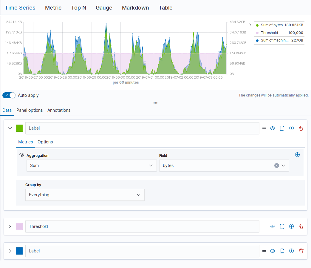
Example:
.es(index= kibana_sample_data_logs,
    timefield='@timestamp',
    metric='avg:bytes')
  .label('Average Bytes for request')
  .title('Memory consumption over time in bytes').yaxis(1,units=bytes,position=left),
.es(index= kibana_sample_data_logs,
    timefield='@timestamp',
    metric=avg:machine.ram)
  .label('Average Machine RAM amount').yaxis(2,units=bytes,position=right)
|
|
|
|
|
Tutorial: Create visualizations with Timelion
editYou collected data from your operating system using Metricbeat, and you want to visualize and analyze the data on a dashboard. To create panels of the data, use Timelion to create a time series visualization,
Add the data and create the dashboard
editSet up Metricbeat, then create the dashboard.
- To set up Metricbeat, go to Metricbeat quick start: installation and configuration
- Go to Dashboards.
- On the Dashboards page, click Create dashboard.
Open and set up Timelion
editOpen Timelion and change the time range.
- On the dashboard, click All types > Aggregation based, then select Timelion.
- Make sure the time filter is Last 7 days.
Create a time series visualization
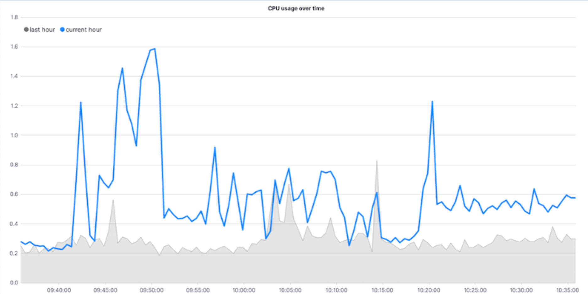
editTo compare the real-time percentage of CPU time spent in user space to the results offset by one hour, create a time series visualization.
Define the functions
editTo track the real-time percentage of CPU, enter the following in the Timelion Expression field, then click Update:
.es(index=metricbeat-*,
    timefield='@timestamp',
    metric='avg:system.cpu.user.pct')
Compare the data
editTo compare two data sets, add another series, and offset the data back by one hour, then click Update:
.es(index=metricbeat-*,
    timefield='@timestamp',
    metric='avg:system.cpu.user.pct'),
.es(offset=-1h,
    index=metricbeat-*,
    timefield='@timestamp',
    metric='avg:system.cpu.user.pct')
Add label names
editTo easily distinguish between the two data sets, add label names, then click Update:
.es(offset=-1h,index=metricbeat-*,
    timefield='@timestamp',
    metric='avg:system.cpu.user.pct').label('last hour'),
.es(index=metricbeat-*,
    timefield='@timestamp',
    metric='avg:system.cpu.user.pct').label('current hour')
Add a title
editTo make is easier for unfamiliar users to understand the purpose of the visualization, add a title, then click Update:
.es(offset=-1h,
    index=metricbeat-*,
    timefield='@timestamp',
    metric='avg:system.cpu.user.pct')
  .label('last hour'),
.es(index=metricbeat-*,
    timefield='@timestamp',
    metric='avg:system.cpu.user.pct')
  .label('current hour')
  .title('CPU usage over time')
Change the appearance of the chart lines
editTo differentiate between the current hour and the last hour, change the appearance of the chart lines, then click Update:
.es(offset=-1h,
    index=metricbeat-*,
    timefield='@timestamp',
    metric='avg:system.cpu.user.pct')
  .label('last hour')
  .lines(fill=1,width=0.5),
.es(index=metricbeat-*,
    timefield='@timestamp',
    metric='avg:system.cpu.user.pct')
  .label('current hour')
  .title('CPU usage over time')
Change the line colors
editTimelion supports standard color names, hexadecimal values, or a color schema for grouped data.
To make the first data series stand out, change the line colors, then click Update:
.es(offset=-1h,
    index=metricbeat-*,
    timefield='@timestamp',
    metric='avg:system.cpu.user.pct')
  .label('last hour')
  .lines(fill=1,width=0.5)
  .color(gray),
.es(index=metricbeat-*,
    timefield='@timestamp',
    metric='avg:system.cpu.user.pct')
  .label('current hour')
  .title('CPU usage over time')
  .color(#1E90FF)
Adjust the legend
editMove the legend to the north west position with two columns, then click Update:
.es(offset=-1h,
    index=metricbeat-*,
    timefield='@timestamp',
    metric='avg:system.cpu.user.pct')
  .label('last hour')
  .lines(fill=1,width=0.5)
  .color(gray),
.es(index=metricbeat-*,
    timefield='@timestamp',
    metric='avg:system.cpu.user.pct')
  .label('current hour')
  .title('CPU usage over time')
  .color(#1E90FF)
  .legend(columns=2, position=nw)
Save and add the panel
editSave the panel to the Visualize Library and add it to the dashboard, or add it to the dashboard without saving.
To save the panel to the Visualize Library:
- Click Save to library.
- Enter the Title and add any applicable Tags.
- Make sure that Add to Dashboard after saving is selected.
- Click Save and return.
To save the panel to the dashboard:
- Click Save and return.
-
Add an optional title to the panel.
- In the panel header, click No Title.
- On the Panel settings window, select Show title.
- Enter the Title, then click Save.
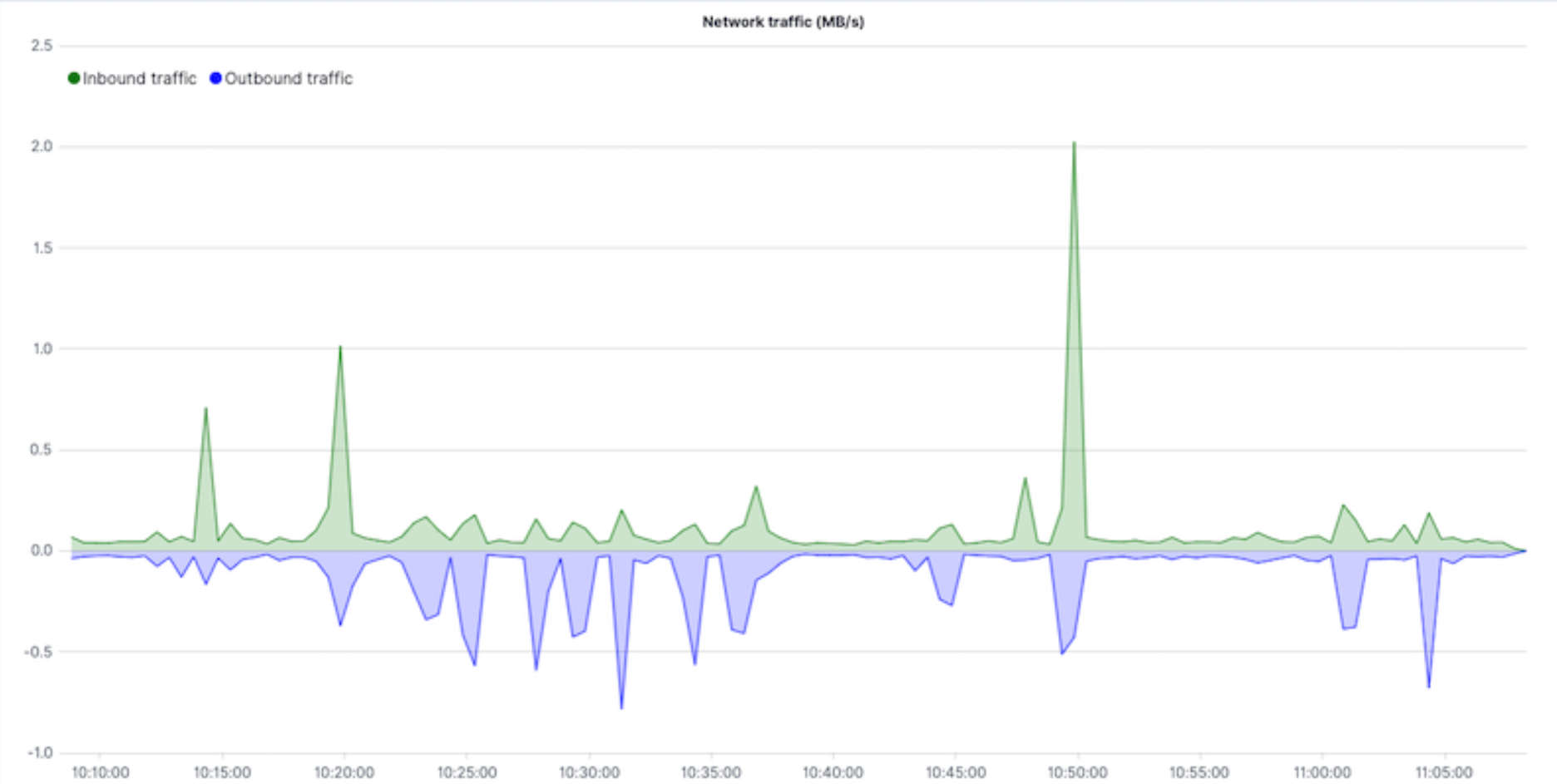
Visualize the inbound and outbound network traffic
editTo create a visualization for inbound and outbound network traffic, use mathematical functions.
Define the functions
editTo start tracking the inbound and outbound network traffic, enter the following in the Timelion Expression field, then click Update:
.es(index=metricbeat*,
    timefield=@timestamp,
    metric=max:system.network.in.bytes)
Plot the rate of change
editTo easily monitor the inbound traffic, plots the change in values over time, then click Update:
.es(index=metricbeat*,
    timefield=@timestamp,
    metric=max:system.network.in.bytes)
  .derivative()
Add a similar calculation for outbound traffic, then click Update:
.es(index=metricbeat*,
    timefield=@timestamp,
    metric=max:system.network.in.bytes)
  .derivative(),
.es(index=metricbeat*,
    timefield=@timestamp,
    metric=max:system.network.out.bytes)
  .derivative()
  .multiply(-1)
|
|
Change the data metric
editTo make the data easier to analyze, change the data metric from bytes to megabytes, then click Update:
.es(index=metricbeat*,
    timefield=@timestamp,
    metric=max:system.network.in.bytes)
  .derivative()
  .divide(1048576),
.es(index=metricbeat*,
    timefield=@timestamp,
    metric=max:system.network.out.bytes)
  .derivative()
  .multiply(-1)
  .divide(1048576)
|
|
Customize and format the visualization
editCustomize and format the visualization using the following functions, then click Update:
.es(index=metricbeat*,
    timefield=@timestamp,
    metric=max:system.network.in.bytes)
  .derivative()
  .divide(1048576)
  .lines(fill=2, width=1)
  .color(green)
  .label("Inbound traffic")
  .title("Network traffic (MB/s)"),
.es(index=metricbeat*,
    timefield=@timestamp,
    metric=max:system.network.out.bytes)
  .derivative()
  .multiply(-1)
  .divide(1048576)
  .lines(fill=2, width=1)
  .color(blue)
  .label("Outbound traffic")
  .legend(columns=2, position=nw)
Save and add the panel
editSave the panel to the Visualize Library and add it to the dashboard, or add it to the dashboard without saving.
To save the panel to the Visualize Library:
- Click Save to library.
- Enter the Title and add any applicable Tags.
- Make sure that Add to Dashboard after saving is selected.
- Click Save and return.
To save the panel to the dashboard:
- Click Save and return.
-
Add an optional title to the panel.
- In the panel header, click No Title.
- On the Panel settings window, select Show title.
- Enter the Title, then click Save.
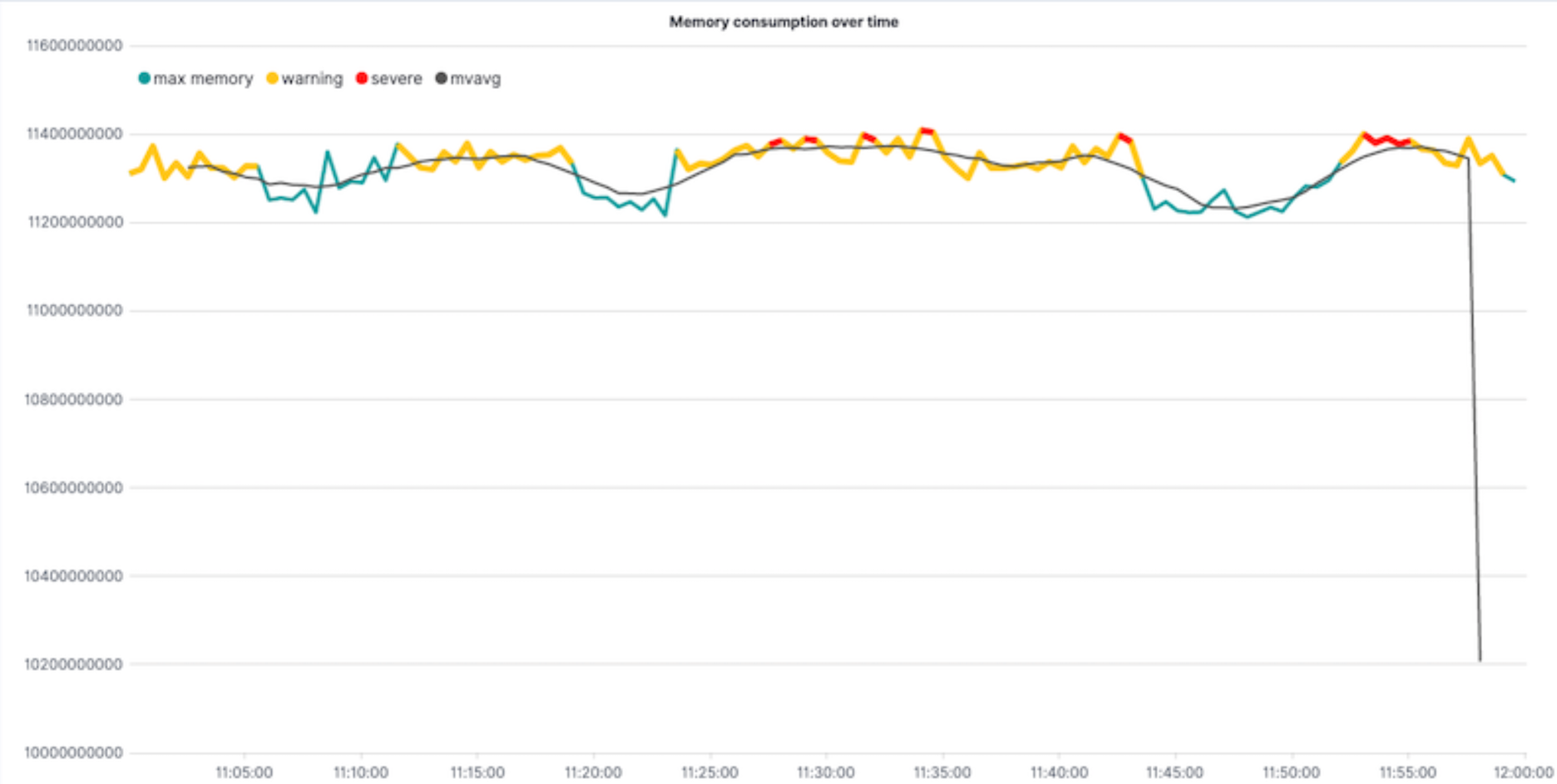
Detect outliers and discover patterns over time
editTo easily detect outliers and discover patterns over time, modify the time series data with conditional logic and create a trend with a moving average.
With Timelion conditional logic, you can use the following operator values to compare your data:
|
|
equal |
|
|
not equal |
|
|
less than |
|
|
less than or equal to |
|
|
greater than |
|
|
greater than or equal to |
Define the functions
editTo chart the maximum value of system.memory.actual.used.bytes, enter the following in the Timelion Expression field, then click Update:
.es(index=metricbeat-*,
    timefield='@timestamp',
    metric='max:system.memory.actual.used.bytes')
Track used memory
editTo track the amount of memory used, create two thresholds, then click Update:
.es(index=metricbeat-*,
    timefield='@timestamp',
    metric='max:system.memory.actual.used.bytes'),
.es(index=metricbeat-*,
    timefield='@timestamp',
    metric='max:system.memory.actual.used.bytes')
  .if(gt,
      11300000000,
      .es(index=metricbeat-*,
          timefield='@timestamp',
          metric='max:system.memory.actual.used.bytes'),
      null)
    .label('warning')
    .color('#FFCC11'),
.es(index=metricbeat-*,
    timefield='@timestamp',
    metric='max:system.memory.actual.used.bytes')
  .if(gt,
      11375000000,
      .es(index=metricbeat-*,
          timefield='@timestamp',
          metric='max:system.memory.actual.used.bytes'),
      null)
  .label('severe')
  .color('red')
|
|
|
|
Timelion conditional logic for the greater than operator. In this example, the warning threshold is 11.3GB ( |
Determine the trend
editTo determine the trend, create a new data series, then click Update:
.es(index=metricbeat-*,
    timefield='@timestamp',
    metric='max:system.memory.actual.used.bytes'),
.es(index=metricbeat-*,
    timefield='@timestamp',
    metric='max:system.memory.actual.used.bytes')
  .if(gt,11300000000,
      .es(index=metricbeat-*,
          timefield='@timestamp',
          metric='max:system.memory.actual.used.bytes'),
      null)
      .label('warning')
      .color('#FFCC11'),
.es(index=metricbeat-*,
    timefield='@timestamp',
    metric='max:system.memory.actual.used.bytes')
  .if(gt,11375000000,
      .es(index=metricbeat-*,
          timefield='@timestamp',
          metric='max:system.memory.actual.used.bytes'),
      null).
      label('severe')
      .color('red'),
.es(index=metricbeat-*,
    timefield='@timestamp',
    metric='max:system.memory.actual.used.bytes')
  .mvavg(10)
|
|
Customize and format the visualization
editCustomize and format the visualization using the following functions, then click Update:
.es(index=metricbeat-*,
    timefield='@timestamp',
    metric='max:system.memory.actual.used.bytes')
  .label('max memory')
  .title('Memory consumption over time'),
.es(index=metricbeat-*,
    timefield='@timestamp',
    metric='max:system.memory.actual.used.bytes')
  .if(gt,
      11300000000,
      .es(index=metricbeat-*,
          timefield='@timestamp',
          metric='max:system.memory.actual.used.bytes'),
      null)
    .label('warning')
    .color('#FFCC11')
    .lines(width=5),
.es(index=metricbeat-*,
    timefield='@timestamp',
    metric='max:system.memory.actual.used.bytes')
  .if(gt,
      11375000000,
      .es(index=metricbeat-*,
          timefield='@timestamp',
          metric='max:system.memory.actual.used.bytes'),
      null)
    .label('severe')
    .color('red')
    .lines(width=5),
.es(index=metricbeat-*,
    timefield='@timestamp',
    metric='max:system.memory.actual.used.bytes')
  .mvavg(10)
  .label('mvavg')
  .lines(width=2)
  .color(#5E5E5E)
  .legend(columns=4, position=nw)
Save and add the panel
editSave the panel to the Visualize Library and add it to the dashboard, or add it to the dashboard without saving.
To save the panel to the Visualize Library:
- Click Save to library.
- Enter the Title and add any applicable Tags.
- Make sure that Add to Dashboard after saving is selected.
- Click Save and return.
To save the panel to the dashboard:
- Click Save and return.
-
Add an optional title to the panel.
- In the panel header, click No Title.
- On the Panel settings window, select Show title.
- Enter the Title, then click Save.
For more information about Timelion conditions, refer to I have but one .condition().