Most frequently used visualizations
editMost frequently used visualizations
editThe most frequently used visualizations allow you to plot aggregated data from a saved search or index pattern.
The most frequently used visualizations include:
- Line, area, and bar charts
- Pie chart
- Data table
- Metric, goal, and gauge
- Tag cloud
Supported aggregations
editThe most frequently used visualizations support the following aggregations:
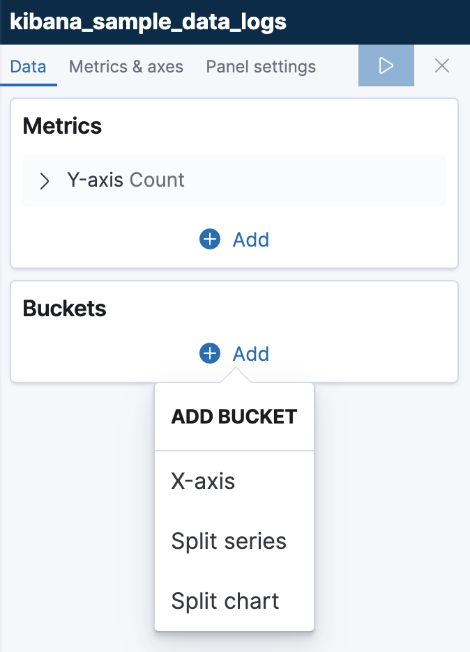
Configure your visualization
editYou configure visualizations using the default editor. Each visualization supports different configurations of the metrics and buckets.
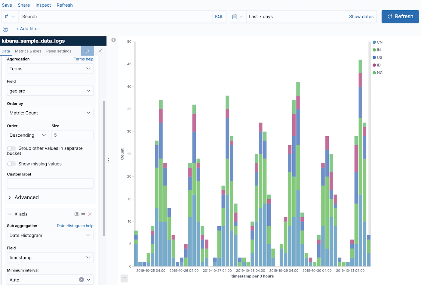
For example, a bar chart allows you to add an x-axis:
A common configuration for the x-axis is to use a Elasticsearch date histogram aggregation:
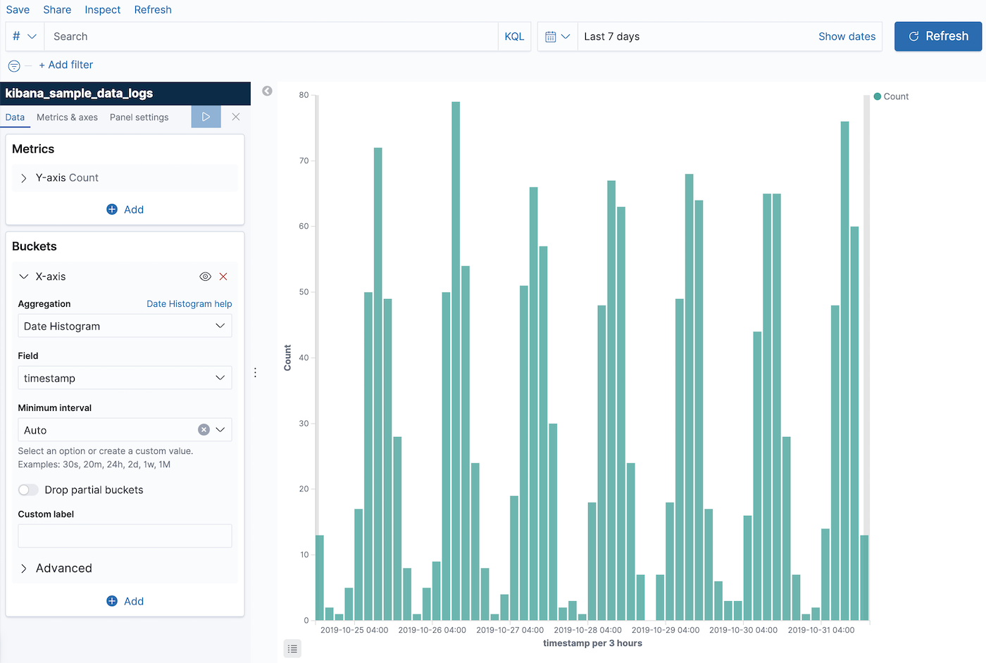
To see your changes, click Apply changes 
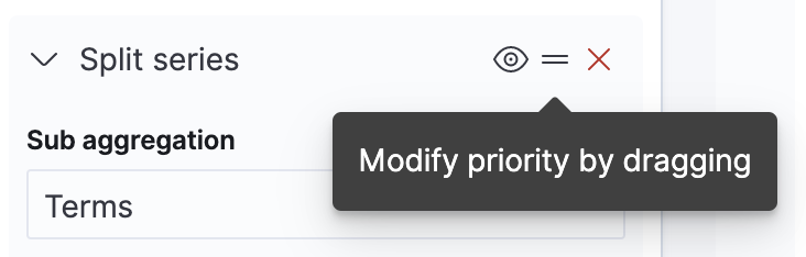
If it’s supported by the visualization, you can add more buckets. In this example we have
added a
Elasticsearch terms aggregation on the field
geo.src to show the top 5 sources of log traffic.
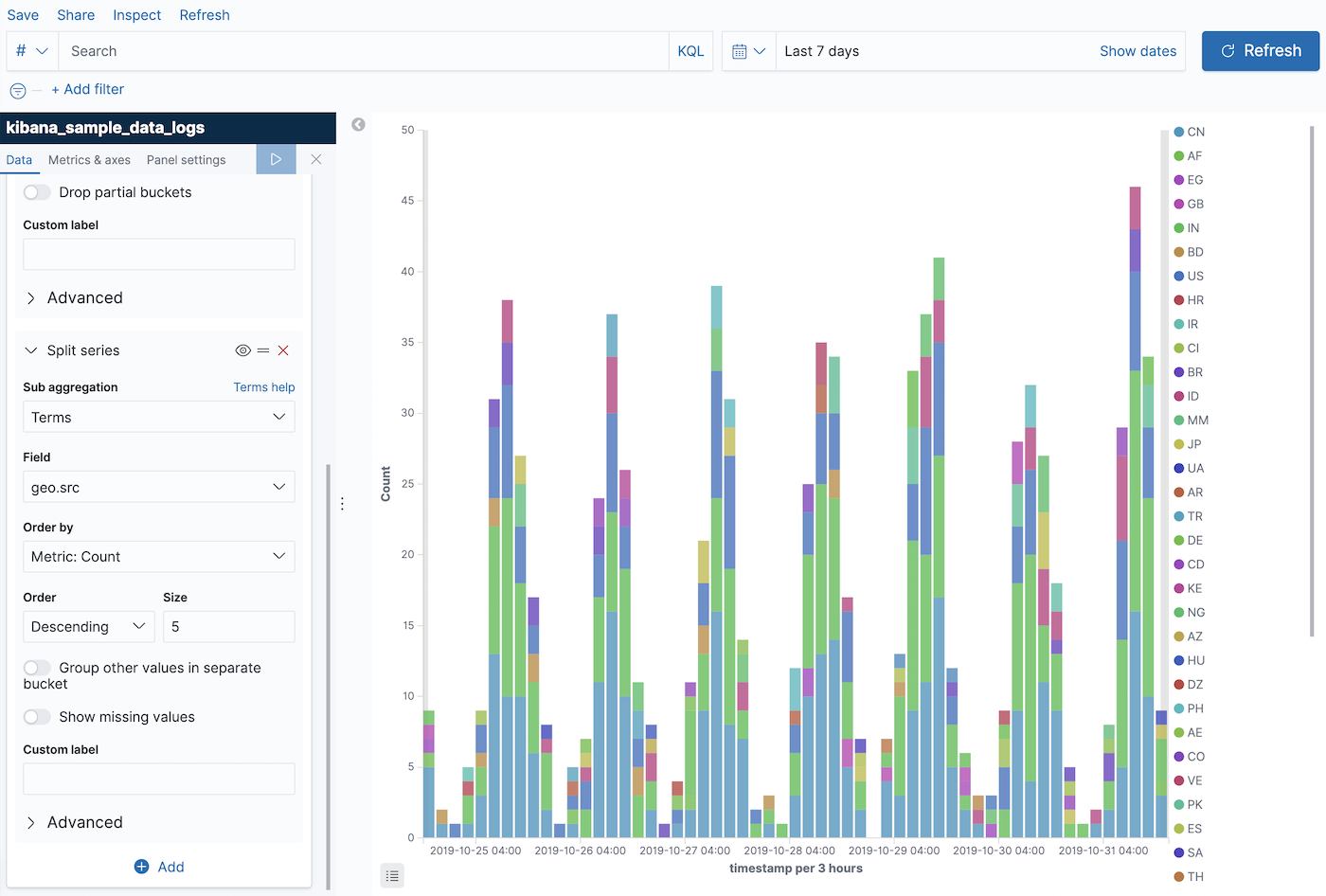
The new aggregation is added after the first one, so the result shows the top 5 sources of traffic per 3 hours. If you want to change the aggregation order, you can do so by dragging:
The visualization now shows the top 5 sources of traffic overall, and compares them in 3 hour increments:
For more information about how aggregations are used in visualizations, see supported aggregations.
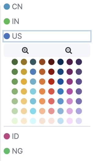
Each visualization also has its own customization options. Most visualizations allow you to customize the color of a specific series: