- Kibana Guide: other versions:
- What is Kibana?
- What’s new in 7.14
- Kibana concepts
- Quick start
- Set up
- Install Kibana
- Configure Kibana
- Alerting and action settings
- APM settings
- Banners settings
- Development tools settings
- Graph settings
- Fleet settings
- i18n settings
- Logging settings
- Logs settings
- Metrics settings
- Machine learning settings
- Monitoring settings
- Reporting settings
- Secure settings
- Search sessions settings
- Security settings
- Spaces settings
- Task Manager settings
- Telemetry settings
- URL drilldown settings
- Start and stop Kibana
- Access Kibana
- Securing access to Kibana
- Add data
- Upgrade Kibana
- Configure security
- Configure reporting
- Configure monitoring
- Production considerations
- Discover
- Dashboard
- Canvas
- Maps
- Build a map to compare metrics by country or region
- Track, visualize, and alert on assets in real time
- Map custom regions with reverse geocoding
- Heat map layer
- Tile layer
- Vector layer
- Plot big data
- Search geographic data
- Configure map settings
- Connect to Elastic Maps Service
- Import geospatial data
- Troubleshoot
- Reporting and sharing
- Machine learning
- Graph
- Alerting
- Observability
- APM
- Security
- Dev Tools
- Stack Monitoring
- Stack Management
- Fleet
- REST API
- Get features API
- Kibana spaces APIs
- Kibana role management APIs
- User session management APIs
- Saved objects APIs
- Index patterns APIs
- Alerting APIs
- Action and connector APIs
- Import and export dashboard APIs
- Logstash configuration management APIs
- Shorten URL
- Get Task Manager health
- Upgrade assistant APIs
- Kibana plugins
- Accessibility
- Release notes
- Developer guide
Function arguments
editFunction arguments
editLet’s look at another expression, which uses the same demodata function, but instead produces a pie chart.

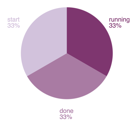
filters | demodata | pointseries color="state" size="max(price)" | pie | render
To produce a filtered set of random data, the expression uses the filters and demodata functions. This time, however, the output becomes the context for the pointseries function, which is a way to aggregate your data, similar to how Elasticsearch works, but more generalized. In this case, the data is split up using the color
and size
dimensions, using arguments on the pointseries function. Each unique value in the state column will have an associated size value, which in this case, will be the maximum value of the price column.
If the expression stopped there, it would produce a pointseries
data type as the output of this expression. But instead of looking at the raw values, the result is inserted into the pie function, which will produce an output that will render a pie visualization. And just like before, this is inserted into the render function, which is useful for its arguments.
The end result is a simple pie chart that uses the default color palette, but the pie function can take additional arguments that control how it gets rendered. For example, you can provide a hole
argument to turn your pie chart into a donut chart by changing the expression to:

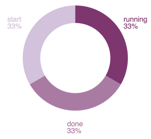
filters | demodata | pointseries color="state" size="max(price)" | pie hole=50 | render