Create time series visualizations with Timelion
editCreate time series visualizations with Timelion
editTo compare the real-time percentage of CPU time spent in user space to the results offset by one hour, create a time series visualization.
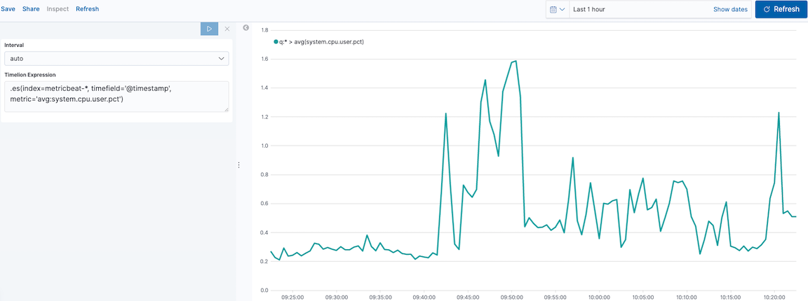
Define the functions
editTo start tracking the real-time percentage of CPU, enter the following in the Timelion Expression field:
.es(index=metricbeat-*,
    timefield='@timestamp',
    metric='avg:system.cpu.user.pct')
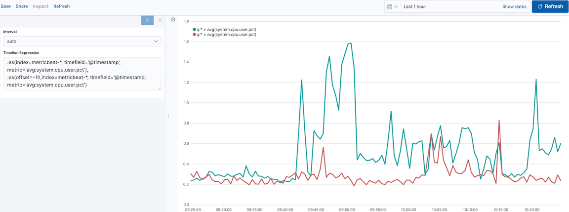
Compare the data
editTo compare the two data sets, add another series with data from the previous hour, separated by a comma:
.es(index=metricbeat-*,
    timefield='@timestamp',
    metric='avg:system.cpu.user.pct'),
.es(offset=-1h,
    index=metricbeat-*,
    timefield='@timestamp',
    metric='avg:system.cpu.user.pct')
|
|
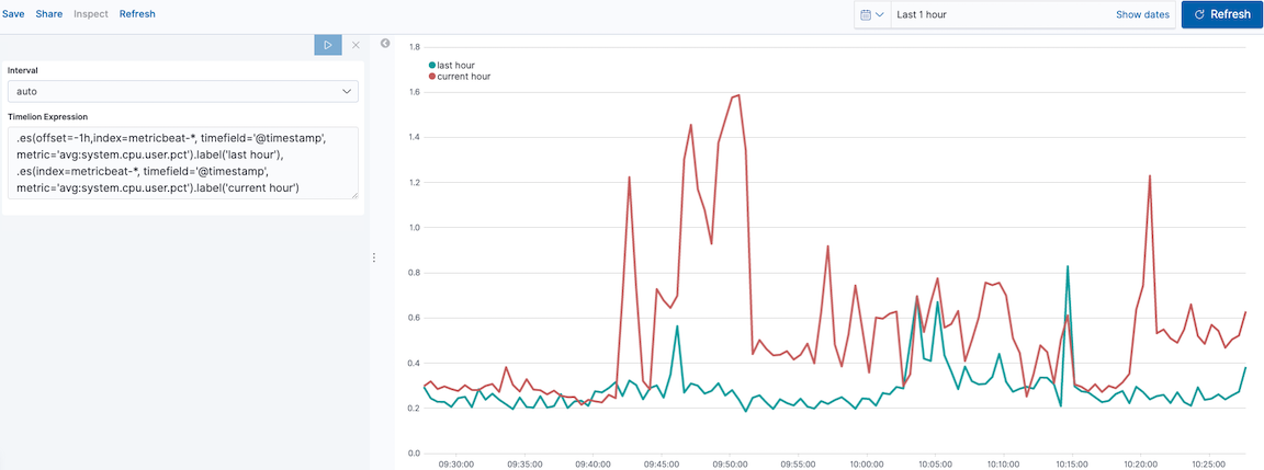
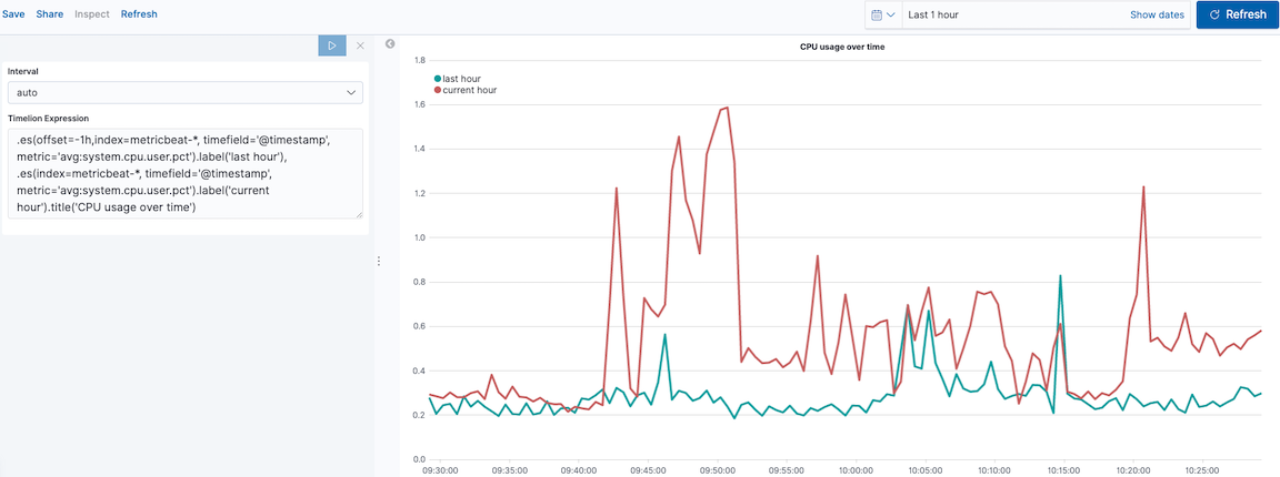
Add label names
editTo easily distinguish between the two data sets, add the label names:
.es(offset=-1h,index=metricbeat-*,
    timefield='@timestamp',
    metric='avg:system.cpu.user.pct').label('last hour'),
.es(index=metricbeat-*,
    timefield='@timestamp',
    metric='avg:system.cpu.user.pct').label('current hour')
Add a title
editAdd a meaningful title:
.es(offset=-1h,
    index=metricbeat-*,
    timefield='@timestamp',
    metric='avg:system.cpu.user.pct')
  .label('last hour'),
.es(index=metricbeat-*,
    timefield='@timestamp',
    metric='avg:system.cpu.user.pct')
  .label('current hour')
  .title('CPU usage over time')
|
|
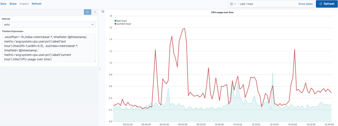
Change the chart type
editTo differentiate between the current hour data and the last hour data, change the chart type:
.es(offset=-1h,
    index=metricbeat-*,
    timefield='@timestamp',
    metric='avg:system.cpu.user.pct')
  .label('last hour')
  .lines(fill=1,width=0.5),
.es(index=metricbeat-*,
    timefield='@timestamp',
    metric='avg:system.cpu.user.pct')
  .label('current hour')
  .title('CPU usage over time')
|
|
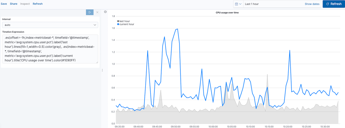
Change the line colors
editTo make the current hour data stand out, change the line colors:
.es(offset=-1h,
    index=metricbeat-*,
    timefield='@timestamp',
    metric='avg:system.cpu.user.pct')
  .label('last hour')
  .lines(fill=1,width=0.5)
  .color(gray),
.es(index=metricbeat-*,
    timefield='@timestamp',
    metric='avg:system.cpu.user.pct')
  .label('current hour')
  .title('CPU usage over time')
  .color(#1E90FF)
|
|
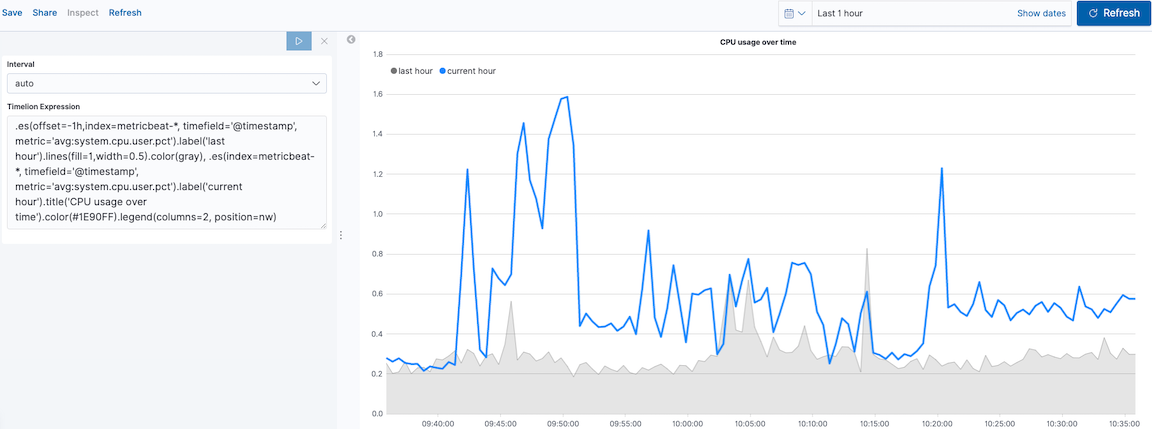
Make adjustments to the legend
editChange the position and style of the legend:
.es(offset=-1h,
    index=metricbeat-*,
    timefield='@timestamp',
    metric='avg:system.cpu.user.pct')
  .label('last hour')
  .lines(fill=1,width=0.5)
  .color(gray),
.es(index=metricbeat-*,
    timefield='@timestamp',
    metric='avg:system.cpu.user.pct')
  .label('current hour')
  .title('CPU usage over time')
  .color(#1E90FF)
  .legend(columns=2, position=nw)
|
|