IMPORTANT: No additional bug fixes or documentation updates
will be released for this version. For the latest information, see the
current release documentation.
Visualizing your data
edit
IMPORTANT: This documentation is no longer updated. Refer to Elastic's version policy and the latest documentation.
Visualizing your data
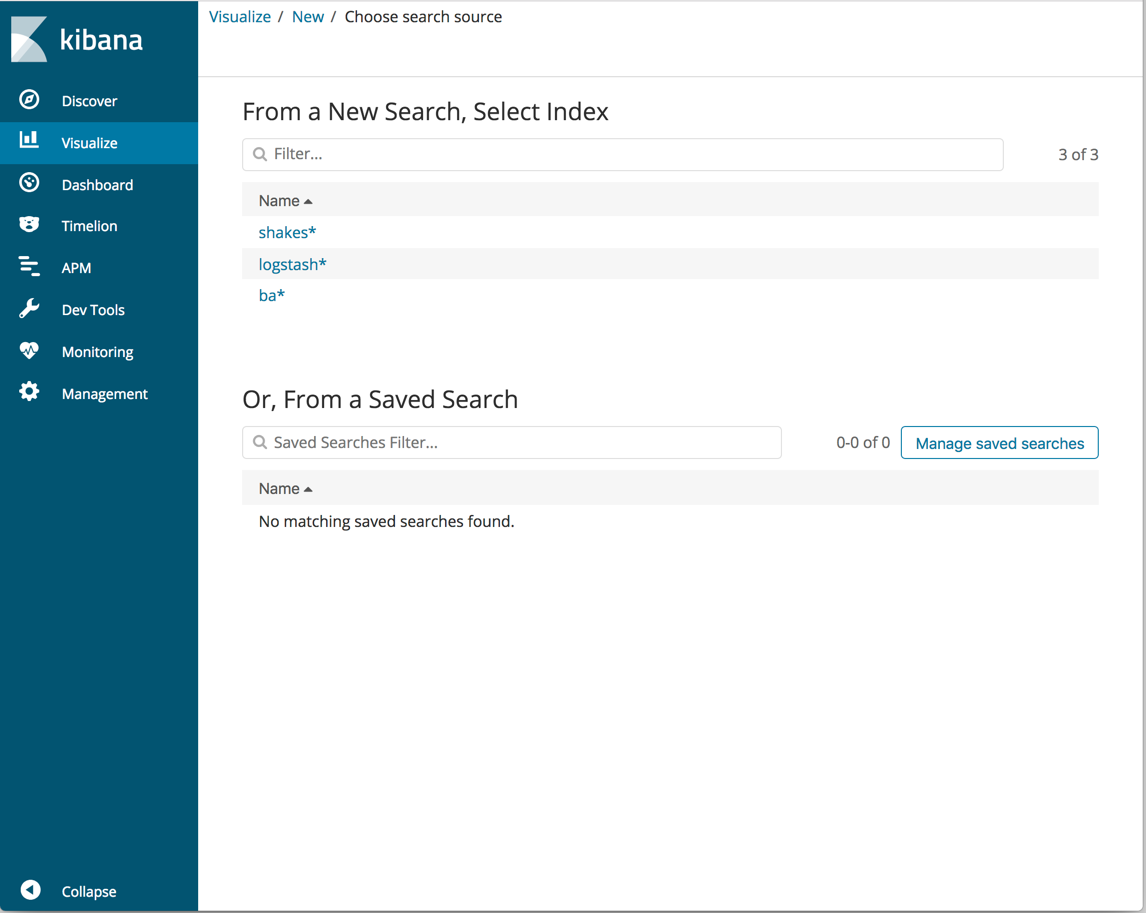
editIn the Visualize application, you can shape your data using a variety of charts, tables, and maps, and more. You’ll create four visualizations: a pie chart, bar chart, coordinate map, and Markdown widget.
- Open Visualize.
-
Click Create a visualization or the + button. You’ll see all the visualization types in Kibana.
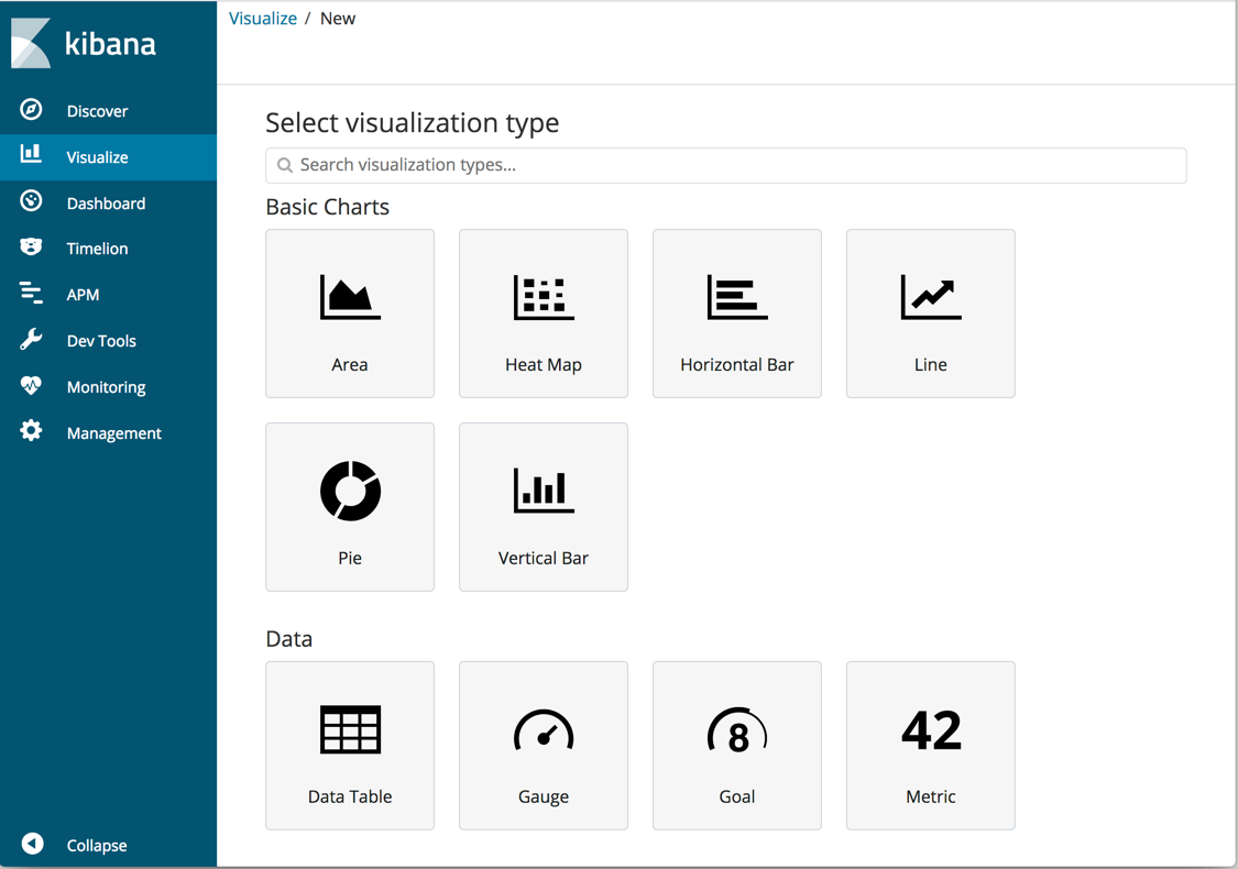
- Click Pie.
-
In New Search, select the
ba*index pattern. You’ll use the pie chart to gain insight into the account balances in the bank account data.