WARNING: Version 5.6 of Kibana has passed its EOL date.
This documentation is no longer being maintained and may be removed. If you are running this version, we strongly advise you to upgrade. For the latest information, see the current release documentation.
Using mathematical functions
editUsing mathematical functions
editYou’ve learned how to create and style a Timelion visualization in the previous two sections. This section will explore the mathematical functions Timelion offers. You will continue to use the Metricbeat data to create a new Timelion visualization for inbound and outbound network traffic. To start, you’ll need to add a new Timelion visualization to the sheet.
In the top menu, click Add to add a second visualization. When added to the sheet, you’ll notice that the query bar has been replaced with the default .es(*) expression. This is because the query is associated with the visualization on the Timelion sheet you have selected.
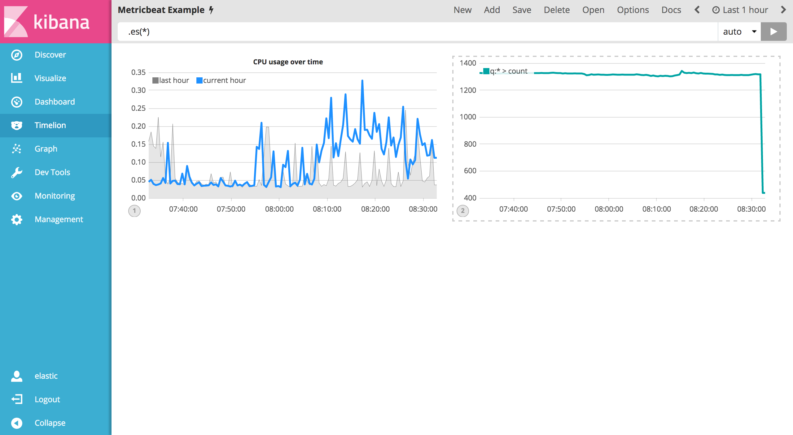
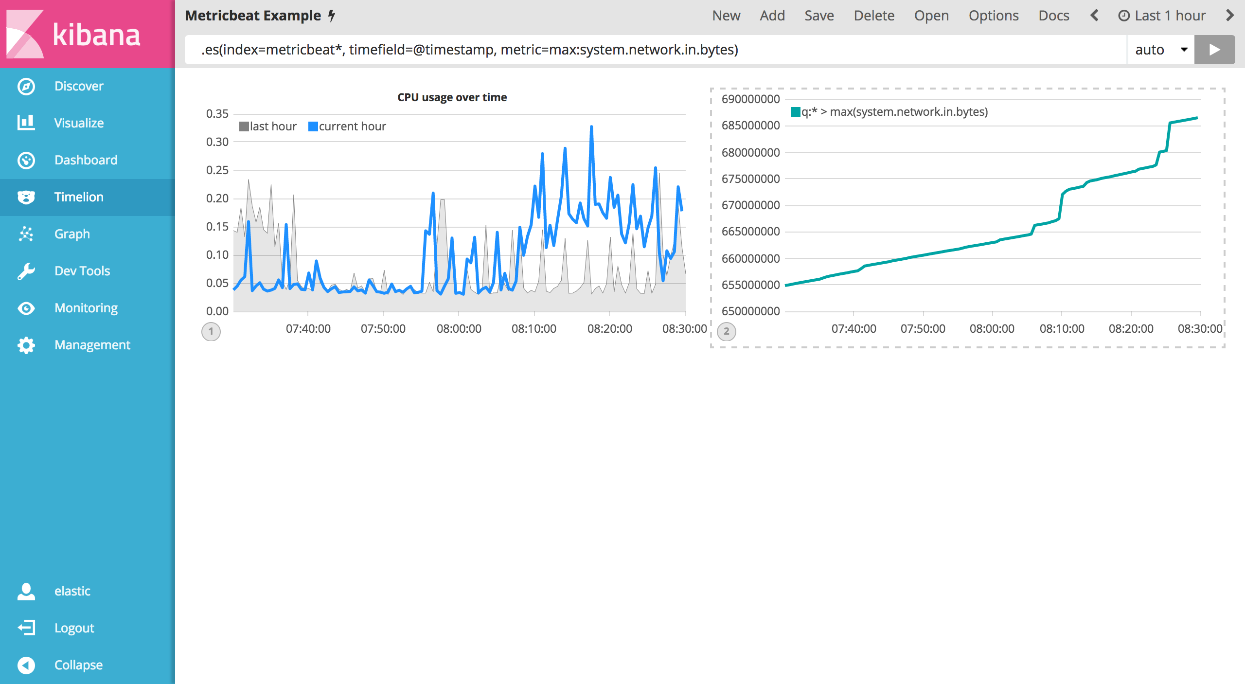
To start tracking the inbound / outbound network traffic, your first expression will calculate the maximum value of system.network.in.bytes. Enter the expression below into your Timelion query bar:
.es(index=metricbeat*, timefield=@timestamp, metric=max:system.network.in.bytes)
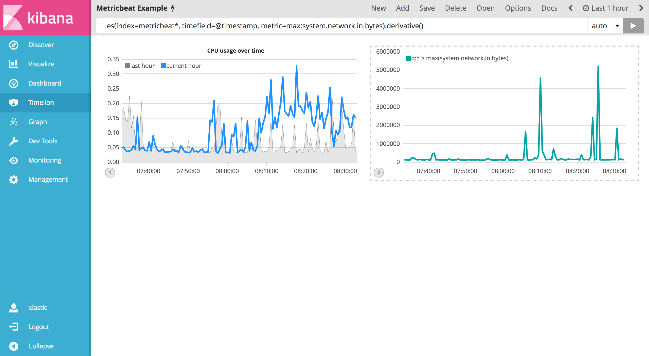
Monitoring network traffic is much more valuable when plotting the rate of change. The derivative() function is used do just that - plot the change in values over time. This can be easily done by appending the .derivative() to the end of an expression. Use the following expression to update your visualization:
.es(index=metricbeat*, timefield=@timestamp, metric=max:system.network.in.bytes).derivative()
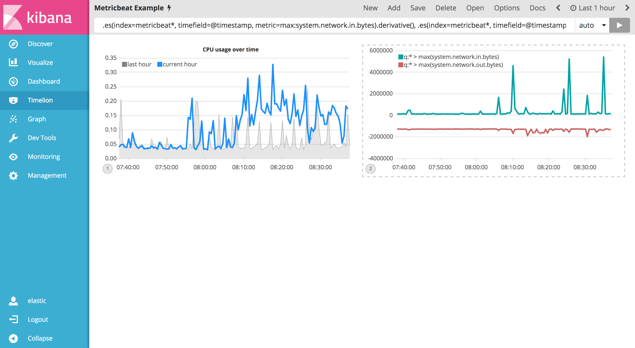
Now for the outbound traffic. You’ll need to add a similar calculation for system.network.out.bytes. Since outbound traffic is leaving your machine, it makes sense to represent this metric as a negative number. The .multiply() function will multiply the series by a number, the result of a series or a list of series. For this example, you will use .multiply(-1) to convert the outbound network traffic to a negative value. Use the following expression to update your visualization:
.es(index=metricbeat*, timefield=@timestamp, metric=max:system.network.in.bytes).derivative(), .es(index=metricbeat*, timefield=@timestamp, metric=max:system.network.out.bytes).derivative().multiply(-1)
To make this visualization a bit easier to consume, convert the series from bytes to megabytes. Timelion has a .divide() function that can be used. .divide() accepts the same input as .multiply() and will divide the series by the divisor defined. Use the following expression to update your visualization:
.es(index=metricbeat*, timefield=@timestamp, metric=max:system.network.in.bytes).derivative().divide(1048576), .es(index=metricbeat*, timefield=@timestamp, metric=max:system.network.out.bytes).derivative().multiply(-1).divide(1048576)
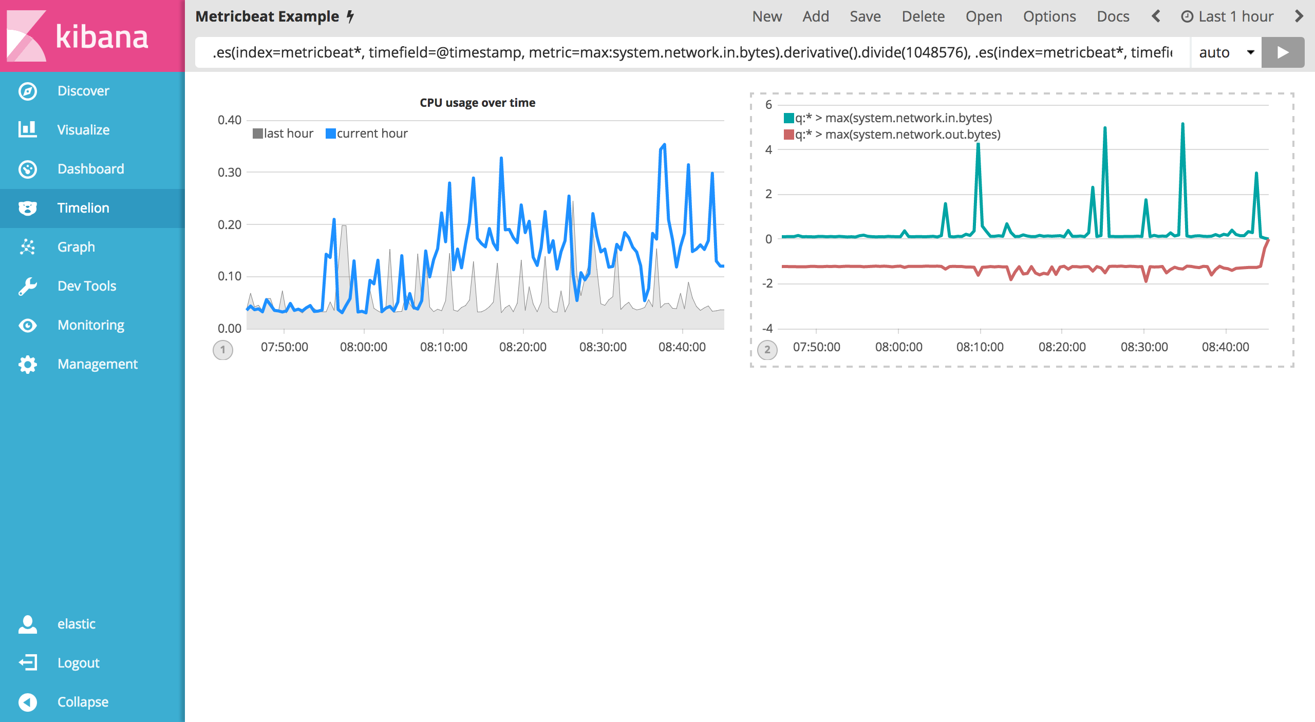
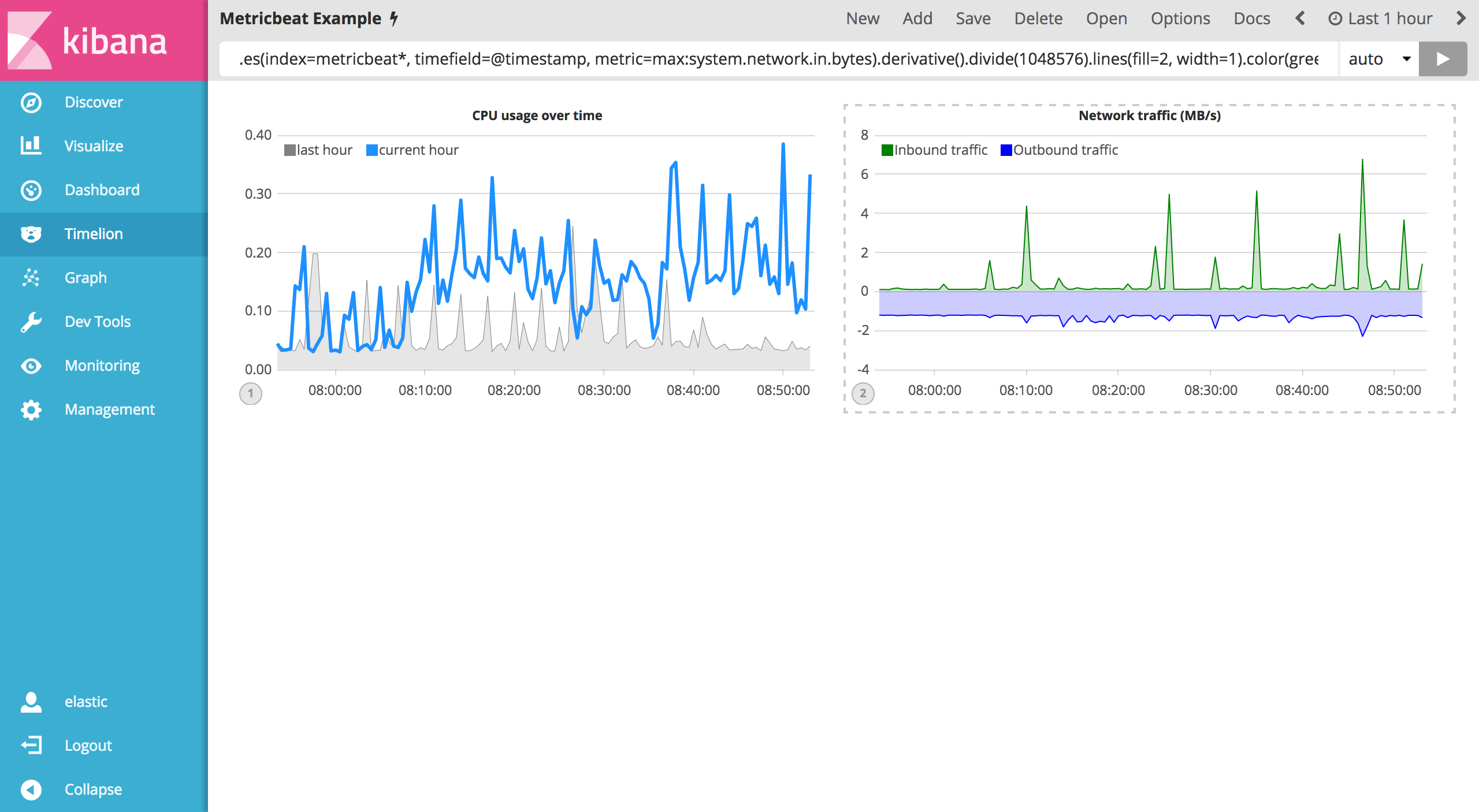
Utilizing the formatting functions .title(), .label(), .color(), .lines() and .legend() learned in the last section, let’s clean up the visualization a bit. Use the following expression to update your visualization:
.es(index=metricbeat*, timefield=@timestamp, metric=max:system.network.in.bytes).derivative().divide(1048576).lines(fill=2, width=1).color(green).label("Inbound traffic").title("Network traffic (MB/s)"), .es(index=metricbeat*, timefield=@timestamp, metric=max:system.network.out.bytes).derivative().multiply(-1).divide(1048576).lines(fill=2, width=1).color(blue).label("Outbound traffic").legend(columns=2, position=nw)
Save your changes and continue on to the next section to learn about conditional logic and tracking trends.